
Hanko are sometimes criticized as being inherently unsafe, since it is possible, if somewhat tedious, to copy the exact image. But then, a signature is just as insecure - if not more so, as a persons signature varies quite a lot, making it even more difficult to determine if it's the "same" signature. But that is beside the point. The real value of signatures and hanko lies not in the markings on a piece of paper but in the act of applying the mark. You have a standard gesture where you show that you accept or approve whatever the document is stating. Making that gesture, especially when witnessed by third parties, is what confers validity. The resulting mark is secondary.
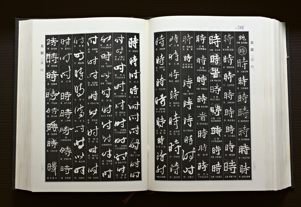
Book of hanko. This page has variations on the character "時", "time". Click on it to see it larger.
Anyway, as a hanko maker he has a lot of books related to the business, and one I found intensely fascinating was a collection of hanko from different makers, grouped by character. It gives a focused view of just how large a variety of graphical forms can still be considered the same in some abstract sense. Those of us who have grown up using the roman alphabet are quite used to seeing wildly varying letter-forms and think nothing of it, even when they're so obscure as to be unreadable out of context. The enormous variety hits you more when you see to see it in graphical forms you're not familiar with to the same intimate degree.
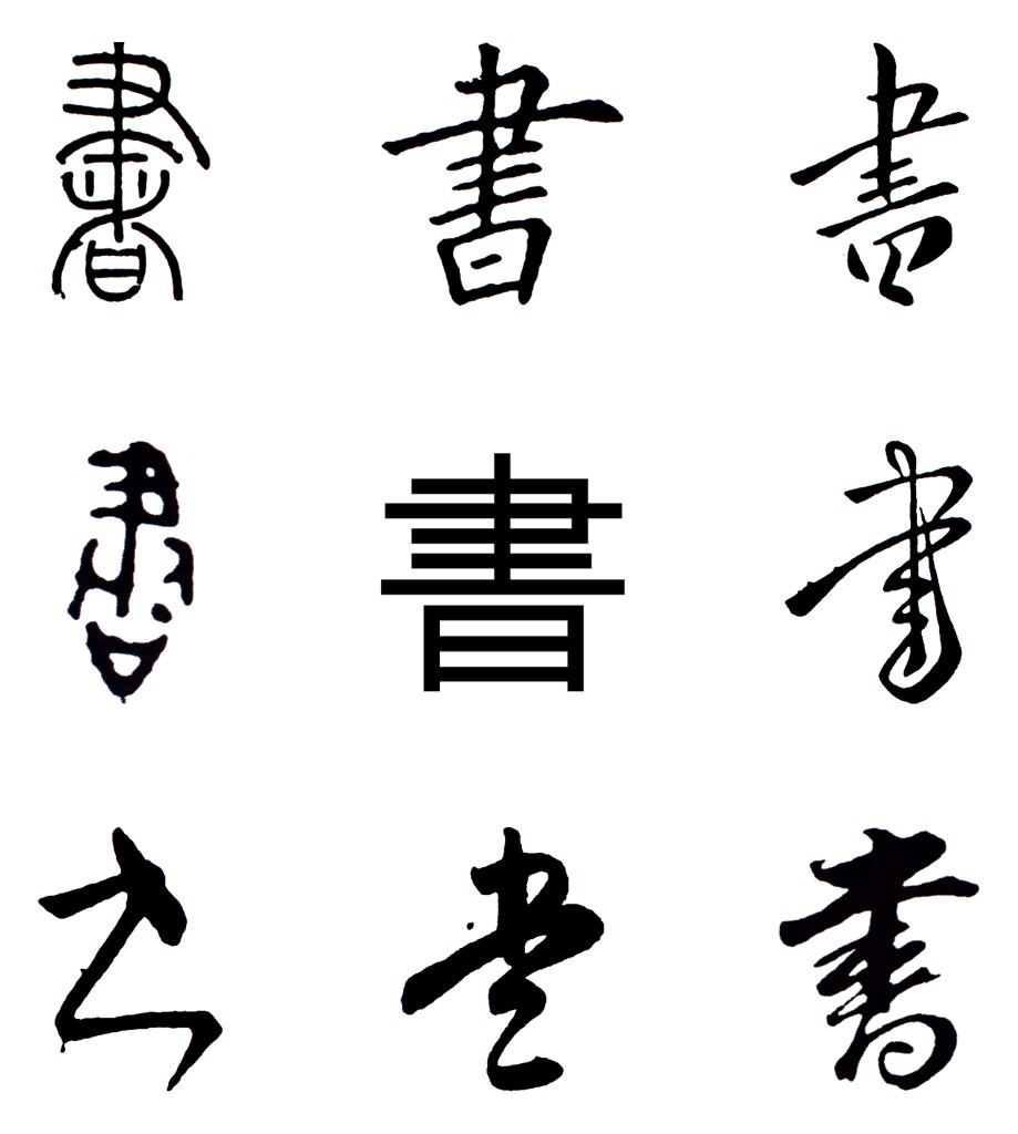
The character "書", "write", with the standard block-type version in the center, surrounded by a selection of forms from the book, inverted and resized to be easily comparable.
Awesome! Didn't know you had a blog. will favourite and keep track (means stalk) you :P
ReplyDelete