
Up means up?
Up means down?
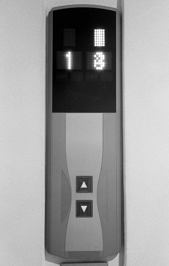
Some elevators have just one "come here" button. Busier elevators often have an "up" and a "down" button, like in the image to the left. The idea is that you tell the elevator where you want to go - up, or down - and it will come and pick you up.
Why not have just a single button? Because a busy elevator is much easier to control - where should I stop and who do I pick up next - if you know which way people are going on each floor. You don't want to stop for somebody going up when you're on the way down to the ground floor.
What's my problem? My problem is, I keep pressing the wrong button. If I think about it, I know I'm supposed to tell the elevator where I want to go. But that's not how my mind sees it. My brain knows that I'm on the first floor, and sees that the elevators are up on some higher floor, so it wants to press the down button, to get an elevator to come down here.
And really, it makes much more sense. After all, when an elevator has only one button that button tells the elevator "come here". If we have two buttons with arrows, they naturally mean "go up" or "go down". Also, we have to tell the elevator where we want to got once we get inside; having to tell it when outside too is redundant, wasteful, repetitive.
I'm not the only one. I've started to take note of what other people do, and from time to time I do see them press the obviously wrong button. The design is not optimal, in other words, and suggests the wrong action for at least some users some of the time.
It's not easy to figure out how to improve it, though. The benefits for elevator scheduling are so large that using just a single button isn't feasible for busy systems. I have no idea how to improve the button layout and design to avoid this either. Perhaps the best solution simply is to fail gracefully; make sure it's easy to reverse the travel direction and otherwise make sure nobody gets too inconvenienced with the inevitable wrong button press.